
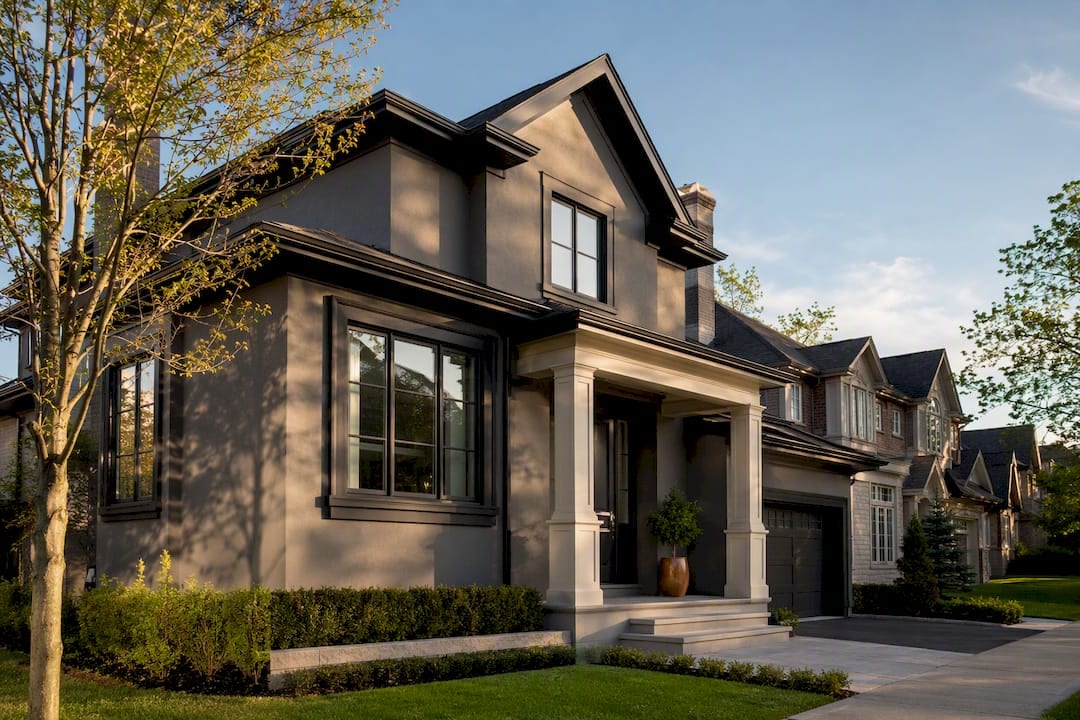
The fastest way to guarantee curb appeal is to pick three to four colors, tie them to your home’s fixed elements like roof and stone, and test large samples on every facade before buying gallons. Skip a single-color plan; skip trusting a paint chip under store lighting. Warmer neutrals are having a real moment in 2026, but resale-safe tones still win when in doubt.
TL;DR:
- Choosing three to four colors based on fixed elements ensures harmony and prevents the house from looking overly costume-like.
- Warm neutral palettes like greige, sage green, and terracotta are trending for 2026, with a shift away from cool gray tones.
- Proper testing of large paint samples at different times of day and on actual surfaces is crucial to avoid costly repainting mistakes.
- Surface prep and professional consultation significantly impact the longevity and appearance of the paint, especially in challenging climates.
- Prioritize matching colors to fixed elements like roof and stone before considering trendy hues to prevent early repainting regrets.
Table of Contents
- 12 Exterior Color Schemes to Steal Right Now
- Which Color Families Are Trending for 2026 Exteriors
- How to Choose an Exterior Color Scheme Step by Step
- Testing Samples and Picking a Finish That Lasts
- What a GTA Painting Specialist Sees on the Job
- What Homeowners Get Wrong About Exterior Color
- Get a Professional Color Consultation and Exterior Paint Job
- Where to Preview Exact Paint Colors Before You Buy
- Sources
12 Exterior Color Schemes to Steal Right Now
Every one of these follows the same structural rule paint pros use: a dominant body color, a supporting trim color, and one or two accents on the door or shutters. Manufacturer guidance from Benjamin Moore backs this three to four color ceiling for a reason. Add more and the house starts looking like it’s wearing a costume.
- Warm off-white body, soft greige trim. Best for colonials and larger homes; low contrast, forgiving on older siding.
- Greige body, dark charcoal trim. Works on modern farmhouses; medium contrast that reads crisp without going harsh.
- Warm clay body, cream trim, deep green door. Best for craftsman bungalows; the green door is the whole trick here.
- Sage body, cream trim, brown accents. Suits homes surrounded by mature trees; blends the house into the landscape instead of fighting it.
- Navy body, white trim, natural wood accents. Best for coastal and cottage styles; high contrast but softened by the wood tone.
- Charcoal body, crisp white trim, red door. Suits small to mid-size modern homes; the red door carries real visual weight, so use it sparingly.
- Deep forest green body, beige trim, black accents. Best for homes on wooded lots; a strong, confident combination that needs mature landscaping to look intentional.
- Black body, white trim, wood-tone door. Works on newer builds with clean lines; this is the highest-contrast option on this list and shows every smudge.
- Pale warm white body, dark navy shutters. Best for traditional two-story homes; classic, low-risk, and it photographs well for resale listings.
- Two-tone light gray upper, darker gray lower. Suits split-level and ranch homes; two-tone treatments add depth without adding a third hue.
- Terracotta body, warm stone accents. Best for Southwestern or Mediterranean-influenced architecture; leans into 2026’s warmer palette shift.
- Light beige body, black trim. Works almost anywhere; it’s the safest high-contrast combination for buyers who want drama without commitment.
Pro Tip: Go low-contrast if your home is on the smaller side or sits close to neighbors, and save high-contrast pairings like black-and-white for homes with more square footage or more distance from the street. Contrast reads as scale, and scale can work against you.
Which Color Families Are Trending for 2026 Exteriors
Gray isn’t dead, but it’s warming up. James Hardie’s color research shows a real shift away from cool blue-gray toward greige, warm off-white, sage green, and clay based tones. Cool grays photograph flat under overcast skies, which is part of why homeowners are moving toward hues with more pigment warmth.
The families worth watching this year:
- Warm off-whites and creams, replacing stark bright whites on trim and siding.
- Greige, the beige-gray hybrid that reads neutral without feeling cold.
- Sage and muted greens, especially on homes with heavy landscaping.
- Warm clay and terracotta, borrowed from Southwestern and Mediterranean palettes.
- Charcoal and navy, used as grounding tones rather than dominant colors.
Valspar’s 2026 trend forecast also flags rising interest in inky blues and soft greens, plus a move toward warmer, darker wood stains for decks and doors. If you live somewhere with intense summer sun, lean toward lighter, more reflective versions of these tones. Full black on a small facade absorbs heat and shows fading faster than almost any other choice.
How to Choose an Exterior Color Scheme Step by Step
Picking colors gets a lot easier once you stop starting with the paint chips and start with what you can’t change.
- Inventory your fixed elements first. Roof color, brick or stone, concrete walkways, and mature landscaping all have undertones your paint has to work with, not against. Behr’s color guidance recommends building your palette around these elements rather than picking a favorite color and hoping it matches.
- Decide your contrast level, then pick a body color family. A one-story ranch usually wants lower contrast; a two-story Victorian can carry more drama.
- Choose trim and one or two accents. This usually means the front door, shutters, and railings. If you’re weighing door styles alongside color, door design trends are worth a look before you commit to a shade.
- Test large samples on every facade, at different times of day. Morning light and afternoon light shift undertones dramatically, especially on north-facing walls.
- Pick your finish and product class. High-UV climates need fade-resistant formulas; humid regions need mildew-resistant options, and trim generally wants a higher sheen than the body.
Watch for these red flags: oversaturated colors on small homes, ignoring the undertone in your roof or stone, and choosing a palette without factoring in how it will age between repaints.
Pro Tip: If your HOA or neighborhood has unwritten color norms, check a few nearby homes before finalizing anything. A palette that looks striking in isolation can look out of place on a street full of similar-era homes.
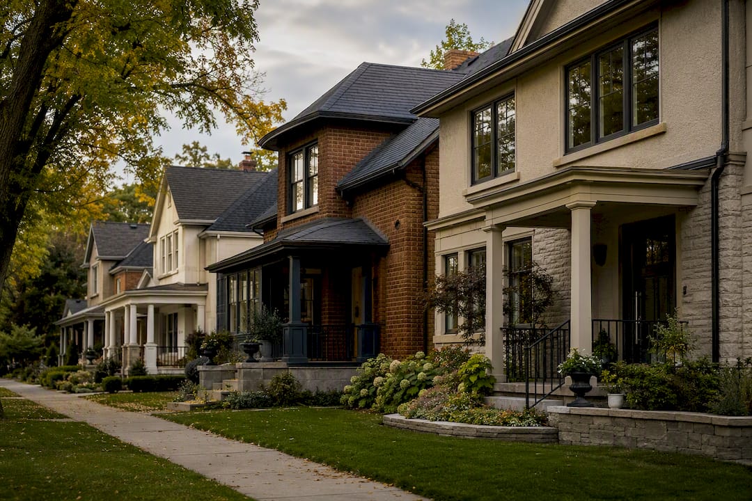
Testing Samples and Picking a Finish That Lasts
Buy quart-size samples and paint panels at least two feet square, not the tiny swatch cards. Move them around the house and view them in direct morning light, midday light, and evening shade, since color behaves differently outdoors than it does on a screen.
- Prop panels against the actual siding or stone, not a neutral background.
- Step back at least twenty feet, the distance most passersby actually see your home from.
- Use digital visualizers for early brainstorming, but never finalize a color from one. They routinely miss the undertone shifts that sunlight and surrounding materials cause.
- Match your finish to the surface: durable exterior paint for siding, a higher sheen for trim, and a UV-rated stain for decks and stairs that face direct sun most of the day.
Darker colors and matte finishes show dirt and fading faster than lighter, satin options, so factor your maintenance tolerance into the color itself, not just the finish.
What a GTA Painting Specialist Sees on the Job
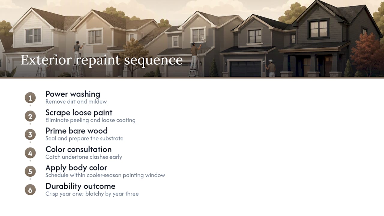
Surface prep decides more than color does. Power washing, scraping loose paint, and priming bare wood before a single coat goes on determines whether that greige body color looks crisp in year one or blotchy by year three. Cooler climates also narrow your painting window, so timing matters as much as the shade you pick.
A professional color consultation catches undertone clashes before they cost you a repaint. Sigma Painting’s consultation process exists for exactly that reason.
What Homeowners Get Wrong About Exterior Color
Most homeowners treat color choice as a taste exercise. It’s actually a materials and lighting exercise dressed up as one. The palette that looks perfect on a laptop screen at 9pm can read completely different against your actual brick at 3pm in July, and that gap is where most repaint regrets start.
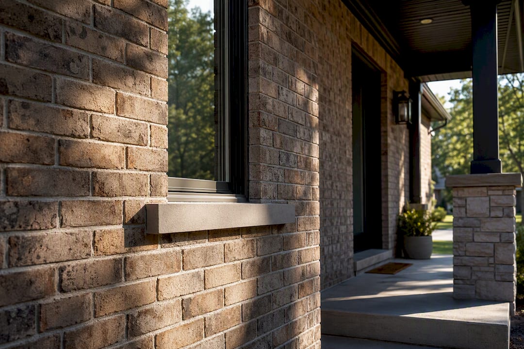
The conventional advice to “just pick what you love” undersells how much your roof, your stone, and your climate constrain the decision before you even open a fan deck. A color that ignores those fixed elements will fight your house for as long as it’s on the walls.
If you take one thing from this, prioritize the fixed elements and the physical sample test over trend chasing. Trends like warm clay and sage green are genuinely good directions for 2026, but they only work if the undertones actually sit well with your roof and stone. Get that match right first, then have fun with the accent color.
— Enrico
Get a Professional Color Consultation and Exterior Paint Job
Choosing the right palette is half the job. Getting it applied correctly, with prep work that makes the color last, is the other half. Sigma Painting handles both: a complimentary color consultation to match your home’s fixed elements, premium exterior paint products rated for GTA winters and summers, full surface prep, and cleanup included in every project.
A first consultation typically covers your home’s style, roof and stone tones, your contrast preference, and a walk-through of sample options before anything gets purchased. From there, Sigma Painting handles scheduling, prep, and application with a completion timeline set upfront, not estimated after the fact.
If your exterior is due for a refresh, request a quote through the exterior painting services page and get a firm plan instead of another season of guessing.
Where to Preview Exact Paint Colors Before You Buy
For browsing real palettes, Sherwin-Williams’ architectural color collections organize combinations by style, and Benjamin Moore’s exterior gallery is strong for classic and coastal looks. Use either visualizer for inspiration, then always confirm the final choice with a physical sample on your own siding.
Sources
- 14 Exterior House Colours & Inspiration | Benjamin Moore
- Exterior home paint ideas and color inspiration | Behr
- The most popular house colors to inspire your siding | James Hardie
- Valspar home exterior color trends (Martha Stewart) — 2026
- Exterior Home Style Color Palettes | Sherwin-Williams


