

The dominant direction for 2026 is clear: warm, nature-rooted palettes built on earthy greens and golden neutrals, anchored by moodier accents like deep red-browns and rich plum. Pick a warm neutral as your base, add one moody accent in a contained space, and test both in your actual light before you commit.
The three hue families driving 2026:
- Earthy greens (smoky jade, sage, muted olive): bedrooms, bathrooms, and cabinetry
- Warm khakis and golden neutrals (mid-tone tan, creamy buff): living rooms, hallways, and open-plan spaces
- Moody accents (deep red-brown, warm mahogany, plum-umber): dining rooms, powder rooms, islands, and built-ins
Table of Contents
- What are the biggest paint color trends for 2026?
- Signature 2026 palettes and what the swatches actually tell you
- Where should you use 2026 trend colors in your home?
- Which sheens and material pairings make 2026 colors look their best?
- How do designers use bold 2026 accents without overcommitting?
- How do you sample and choose the right 2026 shade for your space?
- How do 2026 palettes work with different interior design styles?
- How can you update your existing colors to align with 2026 trends?
- Key Takeaways
- Why 2026 feels like a real shift, not just a trend cycle
What are the biggest paint color trends for 2026?
Four themes are shaping the year’s palettes, and they all point in the same direction: away from the sterile, builder-grade greige of the last decade and toward something more personal and grounded.
Earthy, nature-rooted greens are the headline story. Smoky jade, muted sage, and soft olive are showing up across every major paint line, and it’s not a coincidence. Search interest for “warm green paint” and “earthy neutral paint” increased notably year-over-year in one industry dataset. These greens read as calm rather than bold, which makes them genuinely livable in bedrooms, bathrooms, and cabinetry.
Warmer, golden neutrals are replacing the cool grays that dominated the 2010s. Think mid-tone khaki, creamy buff, and warm sand. Sherwin-Williams named Universal Khaki SW 6150 its 2026 Color of the Year, describing it as a mid-tone neutral with a slight yellow undertone that balances livability with longevity. It’s the kind of color that works in almost any room without looking like a default.
Moodier accent tones are the third thread. Rich plum, deep red-brown, and warm mahogany are appearing as focal-point choices rather than whole-room commitments. PPG named Warm Mahogany its 2026 Color of the Year, calling it a rich, grounded red that’s bold enough to draw attention and restrained enough to stay timeless.
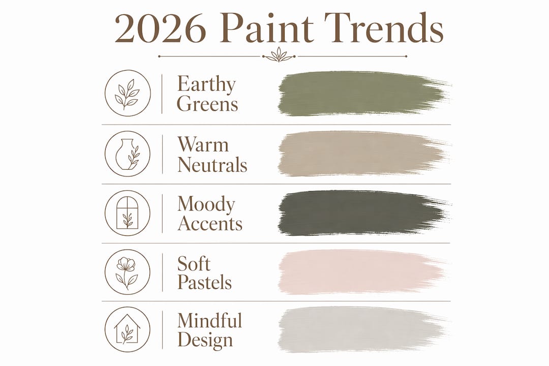
Soft pastels round out the picture. Muted buttery yellows and desaturated sky blues are returning as quiet accent options, recommended for kitchens, breakfast nooks, and entryways where a warm, airy glow is the goal.
The cultural driver behind all of this is what design experts are calling “mindful design”: layered palettes where neutrals act as a sophisticated backdrop for expressive pieces rather than sterile finishes. It’s a direct response to visual overload, and it explains why every major brand is landing in roughly the same place this year.
Signature 2026 palettes and what the swatches actually tell you
Benjamin Moore’s Color of the Year is Silhouette AF-655, described as a burnt umber woven with charcoal, sitting at the moody, grounded end of the spectrum. The broader Benjamin Moore Color Trends 2026 palette pairs it with Swiss Coffee OC-45 (a warm, creamy off-white) and Raindance 1572 (a soft, desaturated blue-green), giving designers a ready-made layering kit of deep anchor, warm neutral, and quiet accent.
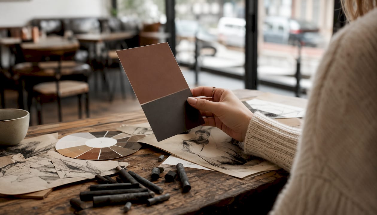
Sherwin-Williams goes wider with its Colormix Forecast 2026, organized into four palette families: Frosted Tints, Restorative Darks, Sunbaked Hues, and Foundational Neutrals. Free color chip samples are available for all four families directly from their site.
| Signature hue | Color family | Best rooms / uses | Recommended finish |
|---|---|---|---|
| Mid-tone warm khaki (e.g., Universal Khaki SW 6150) | Warm neutral | Living rooms, hallways, open-plan spaces | Eggshell |
| Warm burnt umber / charcoal blend (e.g., Silhouette AF-655) | Moody accent | Dining rooms, powder rooms, feature walls | Matte or eggshell |
| Creamy off-white (e.g., Swiss Coffee OC-45) | Soft neutral | Trim, ceilings, secondary walls | Satin or flat |
| Smoky jade / blue-green (e.g., Raindance 1572) | Earthy green | Bedrooms, bathrooms, cabinetry | Eggshell or satin |
| Warm mahogany / deep red-brown | Moody accent | Islands, built-ins, cabinetry, doors | Satin or semi-gloss |
| Muted buttery yellow | Soft pastel | Kitchens, breakfast nooks, entryways | Eggshell |
Pantone’s 2026 signal, Cloud Dancer (11-4201), is an aerated white that designers recommend as a trim or ceiling choice rather than a whole-room decision. It’s most useful for balancing the moodier tones in this year’s palettes.
Most major manufacturers offer downloadable color brochures and free physical chip samples. Benjamin Moore’s Color Trends 2026 brochure is available directly from their site. Sherwin-Williams ships free Colormix chips on request. In-store, you’ll find these collections at most Home Depot and independent paint retailers carrying these lines across the U.S.
Where should you use 2026 trend colors in your home?
Room placement is where most people go wrong. The answer is almost never “paint everything the same moody color.” Here’s how to map the 2026 palette to specific spaces.
- Living rooms and hallways: Warm khakis and golden neutrals work best here. They read differently at morning and evening light, which is actually an asset in high-traffic spaces.
- Bedrooms: Smoky jade and muted sage create calm without feeling cold. These greens are forgiving in north-facing rooms that struggle with gray light.
- Kitchens and cabinetry: This is where moody accents earn their place. A warm mahogany or deep red-brown on lower cabinets, paired with a creamy upper, is one of the strongest moves in the 2026 palette. For cabinetry specifically, the investment is far lower than replacement.
- Bathrooms and powder rooms: Saturated accents work well in small, contained spaces. A plum or espresso on all four walls of a powder room reads as intentional luxury rather than overwhelming.
- Trim and doors: Creamy off-whites or tonal trims rather than brilliant white. Interior doors in a moody accent color are a low-commitment way to test a bold hue. See what color works best on interior doors for practical guidance on this.
Proportion rules of thumb:
- Accents (10–30% of a room’s surface): islands, built-ins, a single door, or one feature wall
- Feature wall only: when you want presence without enclosure
- Full-room: reserve for small, intentional spaces (powder rooms, walk-in closets) or rooms with strong natural light
Finish by surface:
- Walls: eggshell or matte
- Cabinetry and trim: satin or semi-gloss
- Ceilings: flat
Which sheens and material pairings make 2026 colors look their best?
Sheen matters as much as color for perceived luxury. Professionals recommend eggshell or matte on walls to hide imperfections and reduce glare, and satin or semi-gloss on cabinetry and trim for scrubbability and light-controlled highlights. Flat paint on ceilings keeps the eye from being drawn upward.
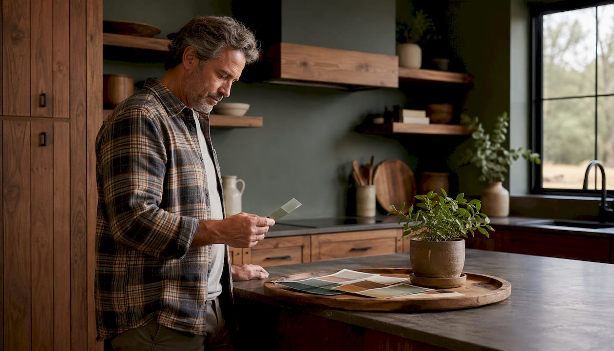
For material pairings, warm neutrals like Universal Khaki read best against natural wood tones, linen textiles, and matte stone surfaces. Moody accents like mahogany or plum-umber pair well with brushed brass or unlacquered bronze hardware, which amplifies the warmth without competing. Avoid polished chrome with these palettes; it pulls the room toward cool and undercuts the earthy direction entirely.
Pro Tip: Skip brilliant white trim when working with warm neutrals or earthy greens. A creamy white like Swiss Coffee OC-45 or a tonal trim that picks up the wall color’s undertone creates a cohesive, color-drenched look that reads as far more premium. Stark white trim creates a hard edge that fragments the palette.
How do designers use bold 2026 accents without overcommitting?
The professional consensus is consistent: use deep, saturated 2026 accent shades on architectural features — millwork, built-ins, kitchen islands — rather than full open-plan walls. Scale is the reason. A moody color on a large, unbroken wall can make a room feel smaller and harder to furnish. The same color on a built-in bookcase or an island reads as intentional and contained.
Designers recommend rich plum, aubergine, and deep red-browns specifically for dining rooms, powder rooms, and cabinetry, where intimacy and luxury are the goal. These aren’t colors you live with on every surface; they’re colors you encounter in a specific moment.
Practical tactics that work:
- Paint a kitchen island in warm mahogany while keeping upper cabinets in a creamy neutral
- Use a deep espresso or umber on a built-in bookcase flanking a fireplace
- Apply a moody accent to interior doors throughout a hallway for a cohesive, unexpected detail
- Layer with woven textiles, natural wood, and matte stone to soften the contrast
Pro Tip: Before committing to a moody accent, check its Light Reflectance Value (LRV). Colors with an LRV below 20 absorb significant light and can make a space feel smaller than it is. For rooms under 150 square feet, aim for an LRV of 25 or above unless you have strong artificial lighting.
How do you sample and choose the right 2026 shade for your space?
Sampling is where most color decisions go wrong, and the fix is straightforward.
- Order physical chips first. Request free samples from Benjamin Moore, Sherwin-Williams, or PPG directly from their websites. Digital swatches on screens are unreliable because monitor calibration varies.
- Buy 2–3 sample pots of your shortlisted colors from a local retailer. Don’t rely on the chip alone.
- Paint large test patches (at least 2 feet by 2 feet) on two or three different walls in the room. One patch on a north-facing wall and one on a south-facing wall will behave completely differently.
- View at three times of day: morning light, midday, and evening with your artificial lights on. Large test patches viewed at different times give a reliable preview; small chips in store lighting do not.
- Photograph without flash. Flash washes out undertones. Natural-light photos on your phone are more accurate.
- Check the LRV of your final choice. Most manufacturer websites list it on the color detail page.
- When in doubt, call a pro. Many professional painters, including Sigma Painting, offer complimentary color consultations that can save you from a costly repaint.
Common mistakes: testing only in store lighting, using a 2-inch chip to judge a whole wall, and ignoring how the color interacts with your flooring and furniture.
How do 2026 palettes work with different interior design styles?
The 2026 palette is unusually versatile across styles, which is part of why the cross-brand alignment feels significant this year.
Modern and contemporary: Pair Universal Khaki or a warm greige with matte black hardware and clean-lined furniture. The warmth of the neutral softens the austerity of modern design without losing its precision.
Rustic and farmhouse: Earthy greens and warm mahogany are natural fits here. Sage or smoky jade on shiplap or board-and-batten reads as deeply intentional. Layer with raw linen, reclaimed wood, and aged brass.
Minimalist: The restraint built into this year’s palette suits minimalism well. A single warm neutral on all four walls with tonal trim and no accent color is a legitimate 2026 move. The key is finish: matte throughout, with one satin surface (a door, a cabinet) to create quiet contrast.
Traditional and transitional: Silhouette AF-655’s burnt umber and charcoal blend is made for traditional interiors. It pairs naturally with dark wood furniture, oil-rubbed bronze, and layered textiles. Swiss Coffee OC-45 as a trim color completes the look without the harshness of brilliant white.
How can you update your existing colors to align with 2026 trends?
You don’t need to repaint every room. The most effective updates work with what you already have.
If your walls are a cool gray or blue-gray, the fastest move is to repaint trim and doors in a warm creamy white rather than the brilliant white you likely have now. That single change shifts the room’s temperature noticeably toward the 2026 direction.
If you have warm beige walls that feel dated, a moody accent on cabinetry or a built-in is a lower-cost way to modernize the space. Repainting cabinets rather than replacing them is one of the highest-return updates in a kitchen, and it’s where the 2026 moody accent palette does its best work.
For rooms with existing neutral walls that are still working, add the trend through accessories first: textiles, a painted door, or a single piece of furniture in a 2026 accent hue. If it reads well, you have your answer before you open a paint can.
One practical note: if you’re updating exterior colors to complement an interior refresh, regional material pairings matter. A guide to exterior color choices for your area can help you keep the palette coherent from the outside in.
Key Takeaways
The strongest move in 2026 is a warm neutral base paired with one contained moody accent, tested in your own light before you commit to a full room.
| Point | Details |
|---|---|
| Dominant 2026 palette | Earthy greens, warm khakis, and moody red-browns are the year’s core hue families across all major brands. |
| Layer, don’t saturate | Use moody accents on cabinetry, islands, or built-ins at 10–30% of room surface rather than full walls. |
| Sheen drives the finish | Eggshell or matte on walls, satin or semi-gloss on cabinetry and trim for durability and a premium look. |
| Sample in your light | Paint 2-foot-by-2-foot test patches on multiple walls and view them at morning, midday, and evening before deciding. |
Why 2026 feels like a real shift, not just a trend cycle
What strikes me about this year’s palette is how much agreement there is across brands that rarely align. Benjamin Moore, Sherwin-Williams, and PPG have all landed in the same territory: warm, grounded, nature-rooted. That kind of cross-brand convergence usually signals a genuine cultural shift rather than a marketing coincidence.
The move away from cool gray and toward warm neutrals and earthy greens reflects something real about how people want to feel in their homes right now. The “mindful design” framing isn’t just language; it describes a preference for spaces that feel considered and personal rather than staged. Layering is the mechanism: a warm neutral base, one moody accent in a contained location, and materials that reinforce the warmth.
The practical implication is that 2026 is actually a forgiving year to repaint. The palette is cohesive enough that almost any combination of warm neutral and earthy accent will work together, which reduces the risk of a costly mistake. Where it gets complicated is scale: open-plan spaces, complex cabinetry, or rooms where you’re layering multiple accent tones. That’s where professional execution makes the difference between a palette that looks intentional and one that just looks busy.
If you’re working on a large open-plan repaint, cabinetry refinishing, or a multi-room color layering project, Sigma Painting’s interior painting services include a complimentary color consultation. For cabinetry specifically, the cabinet painting and refinishing service is the most direct way to bring the 2026 moody accent palette into a kitchen without a full renovation.
Recommended
- Exterior Paint Colours for Pickering Homes — Painter’s Guide | Sigma Painting
- Benjamin Moore vs Sherwin-Williams — Painter’s Honest Comparison | Sigma Painting
- 5 Signs It’s Time to Repaint Your Exterior — GTA Painter’s Guide | Sigma Painting
- Cabinet Painting vs Replacement — GTA Homeowner’s Guide | Sigma Painting


