
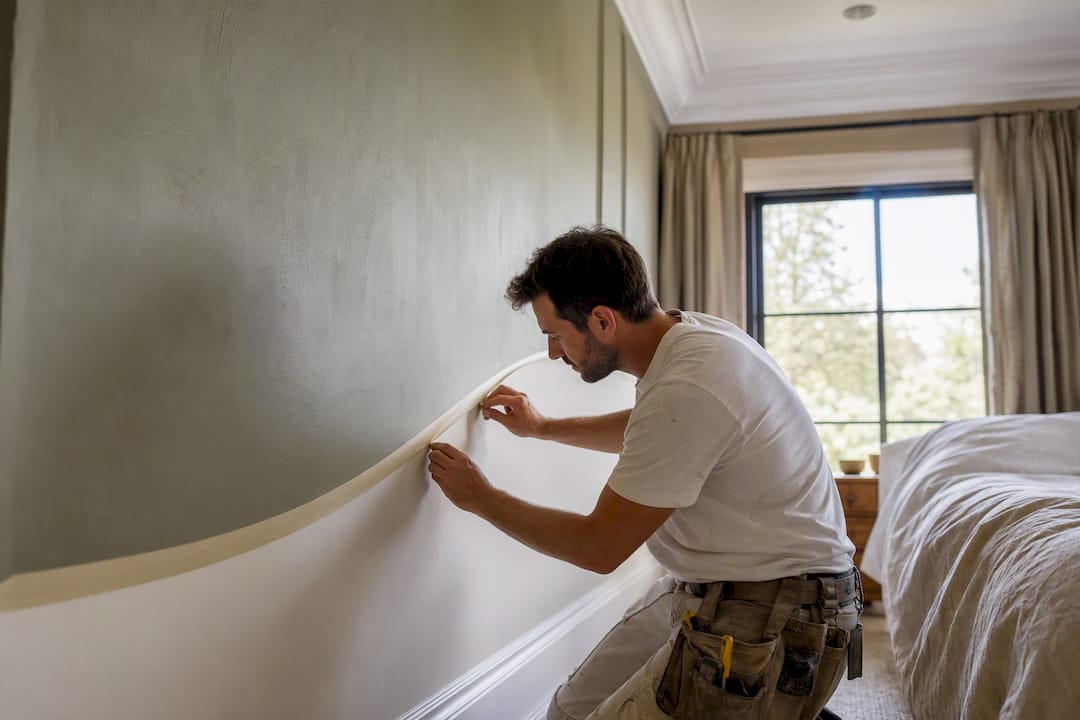
Two tone walls work because they let you commit to a bold color without living inside it. The reliable formula: darker or more saturated color on the bottom third to two-thirds of the wall, lighter on top to keep the room feeling open. For rooms with detailed trim or tricky sightlines, a professional crew like Sigma Painting gets you the other 10% without the redo.
TL;DR:
- Using a darker, saturated color on the lower two-thirds of the wall and a lighter tone on top creates a balanced, open feeling, especially for small or low-ceilinged rooms.
- The most common split heights are low (30-36 inches), halfway (around 48 inches), and high (two-thirds up), with deliberate variation in split position creating a more intentional look.
- Choosing a color palette with warm, complex neutrals or muted earthy tones in 2026 will provide a more sophisticated, updated appearance compared to last decade’s gray-on-gray schemes.
- Proper prep—including patching, priming, and taping with a sealed edge—is critical for sharp, long-lasting two-tone finishes, especially when working with different sheens.
- Blended transitions or soft edges can be achieved with wet-on-wet techniques or narrow transition bands for a more artistic or casual style.
Table of Contents
- Two Tone Wall Ideas Worth Copying
- Which Color Should Be Darker and Where Should the Split Go?
- Tools and Prep Before You Start Painting
- How to Paint Two Tone Walls Step by Step
- Fixing Common Two Tone Wall Mistakes
- Softening or Sharpening the Transition Line
- Keeping Two Tone Walls Looking Sharp Over Time
- Why the “Just Pick Two Colors” Advice Falls Short
- Get a Flawless Two Tone Finish Without the Guesswork
- Sources
Two Tone Wall Ideas Worth Copying
Before picking colors, pick a shape. The split pattern you choose changes the whole feel of a room, and some patterns solve real problems (like protecting drywall from scuffs) while others are purely visual drama.
The most common approaches:
- Top and bottom split — the classic version, usually broken somewhere between hip height and around the midpoint of the wall.
- Wainscot or rail-inspired split — the dividing line is placed low, roughly at a height typical for wainscoting, mimicking the look of painted wood paneling without the carpentry.
- Half-to-ceiling split — the darker color climbs most of the wall, leaving only a band near the crown for the lighter shade, which can make a tall room feel more intimate.
- Diagonal or vertical splits — less common, more contemporary, and best reserved for a single accent wall rather than a whole room.
- Ombré or blended transitions — no hard line at all, just a soft gradient between two tones, achieved by working wet-to-wet and blending with a brush or sponge in small sections, a technique borrowed straight from professional finishers according to Elle Decor’s design galleries.
Room by room, the strategy shifts. A bedroom usually calls for calming, tonal pairs — two shades of the same muted blue or sage rather than a stark contrast, since you want the space to relax you, not energize you. A dining room can handle more drama: think deep terracotta below and warm cream above, a pairing built to be seen under evening light. Bathrooms benefit from a bold, darker color on the lower half specifically because that’s the zone that takes the most splashing and scuffing. Hallways do well with a low split, since a wainscot-height line hides the scrapes that backpacks and stroller wheels leave behind. Kids’ rooms are where you can get playful: soft pastels paired with white trim age well as the child grows, unlike a full wall of primary colors.
On the palette side, Better Homes & Gardens points to a real shift happening in 2026: flat, cool grays are giving way to warmer, more complex neutrals like greige and warm cream, plus muted earthy tones such as olive, terracotta, and soft sage. These read as more sophisticated than the gray-on-gray combinations that dominated the last decade. For inspiration on classic combinations, Elle Decor’s roundup highlights nautical blue with crisp white, muted gray with cream, soft pastels against white trim, and graphic black-and-white pairings for a modern look. Complementary pairs (colors opposite each other on the color wheel) create energy; analogous pairs (colors next to each other) create calm. Know which effect you’re after before you buy a single sample pot.
Which Color Should Be Darker and Where Should the Split Go?
There’s no hard rule that says the bottom must always be darker, but it’s the dominant approach for good reason: a heavier color low on the wall grounds the room, the way a dark rug or a solid piece of furniture does. A lighter color above keeps the eye moving upward and the ceiling feeling higher. Painting the upper wall and ceiling the exact same light color is a classic trick for making a small or low-ceilinged room feel bigger, since it removes the visual line where wall meets ceiling.
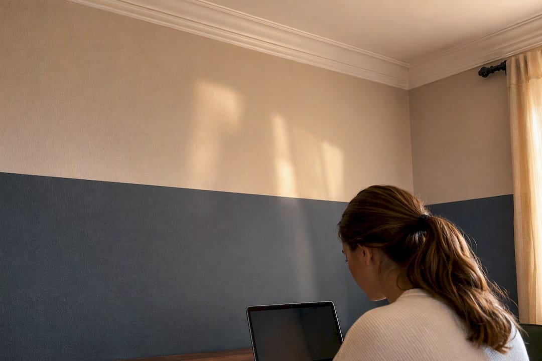
There are good reasons to break the rule. A dark ceiling paired with a lighter wall creates a cozy, enclosed feeling that works well in a den or a formal dining room used mostly at night. A dark upper band with lighter lower walls can also make an overly tall room feel more human-scaled by visually lowering the ceiling.
Split height is where most of the design decision-making happens:
- Low split (roughly 30 to 36 inches): reads as a wainscot line, classic and formal, good for hallways and dining rooms.
- Halfway split (roughly 48 inches on an 8-foot wall): the boldest, most graphic option, best in rooms where you want the two-tone effect to be the main event.
- High split (two-thirds up the wall or higher): softens a tall room and works well when you want the lighter color to feel like the “main” wall color with the darker band as an accent.
Designers increasingly skip the exact halfway mark on purpose. Sherwin-Williams color expert Sue Wadden recommends varying the split height deliberately, lower, higher, or just off-center, since an intentionally uneven proportion tends to read as more designed than a mechanical 50/50 split, according to Better Homes & Gardens.
Light changes everything about how these colors perform. A greige that looks warm and neutral under midday sun can turn muddy or greenish under LED bulbs at night. Elle Decor recommends testing swatches directly on the wall you’re painting, and checking them at different times of day, because small undertone differences between your two chosen colors become much more obvious once they’re sitting next to each other on real drywall instead of on two paint chips at the store.
Tools and Prep Before You Start Painting
Two-tone walls live or die on prep. A crisp line on a poorly patched wall still looks like a poorly patched wall, just with two colors instead of one.
Here’s what you need before you open a single can:
- Painter’s tape in both low-tack (for delicate or freshly painted surfaces) and medium-tack (for standard drywall) varieties.
- An angled sash brush for cutting in along the tape line and into corners.
- Rollers with the right nap for your wall texture; smoother walls take a shorter nap, textured walls need something thicker to get into the grooves.
- A roller tray, drop cloths, spackle, sandpaper, and a stain-blocking primer for patching and sealing repairs before color goes on.
- A 4-foot level or a laser level, plus a pencil, for marking your split line accurately.
On prep itself: clean the walls first, since dust and grease keep paint from bonding properly. Patch nail holes and dings with spackle, let it dry fully, then sand smooth. Any patched area, or any wall where you’re painting a light color over a dark one, needs a stain-blocking primer so old color doesn’t bleed through the new coat. Professional painters consistently point to this step, along with using the right nap roller and multiple tape widths, as the difference between a finish that looks durable and one that starts showing wear within a year, according to Painters Solutions.
Finish selection matters more on a two-tone wall than a single-color one, because the two sheens sit side by side and any mismatch is obvious. Matte finishes hide imperfections well but show scuffs fast, making them a tough fit for a lower band in a busy hallway. Eggshell splits the difference, wiping clean better than matte while still looking soft. Satin is the toughest of the three and the smart pick for lower sections in kids’ rooms, bathrooms, or hallways where hands and shoulders make contact often.
How to Paint Two Tone Walls Step by Step
Once the walls are clean, patched, and primed where needed, the actual painting comes down to five steps.
- Mark your split line from one fixed point. Pick a single reference point on the floor, measure up to your target height, and mark it. Then use a 4-foot level or a laser level to carry that mark around the entire room, rather than measuring up from the floor independently on every wall. Floors and ceilings are rarely perfectly level, so measuring wall by wall almost always produces a crooked line, according to The DIY Playbook.
- Paint the base color first. Most painters start with whichever color goes on the larger area, typically the top, and give it a full coat with proper dry time. If you’re planning to tape over this color and paint a second coat over the tape edge (see step 3), let it cure fully before taping.
- Tape the line and seal the edge. Run your painter’s tape exactly along the pencil line, then burnish the edge firmly with a putty knife or the back of a plastic scraper so paint can’t creep underneath. For extra insurance, paint a thin coat of the base color directly over the tape edge before switching colors. This seals any tiny gaps with a color that matches what’s already there, so if paint bleeds, it bleeds the right color, a trick referenced consistently across professional how-to guides, per ImpactWizards.
- Paint the second color. Cut in along the taped edge first with an angled brush, then roll the rest of the section. Work from the taped line outward so you’re not dragging a loaded roller back toward wet tape.
- Pull the tape at the right moment and touch up. Remove tape while the paint is still slightly tacky rather than fully dry, peeling it back slowly at a low angle. Fully cured paint is more likely to chip away with the tape. Keep a small artist’s brush on hand for any thin spots that need a second pass once the tape is off.
Pro Tip: Paint your second coat within the same day if you can. Letting the first color cure for a full 24 to 48 hours before taping gives you the cleanest possible edge, since fresh paint is softer and more prone to lifting when tape comes off.
If you’re going for a blended or ombré look instead of a hard line, skip the tape entirely. Work wet-to-wet where the two colors meet, feathering the edge with a dry brush or a damp sponge in short overlapping strokes until the transition disappears.
Fixing Common Two Tone Wall Mistakes
Even careful painters run into the same handful of problems. Most have quick fixes.
- Bleed-through under the tape: let the touch-up color dry, then feather the edge with a small artist’s brush rather than repainting the whole section; for bigger bleeds, re-tape and recut the line.
- A visibly crooked line: if it’s off by a fraction of an inch and only visible up close, it’s often not worth re-doing; if the room’s floor is noticeably out of level and the line reads crooked from across the room, re-measure using your fixed-point method and shift the whole line rather than patching one section.
- Flaws showing through the finish: a glossier sheen reflects more light and highlights every roller mark and patch; if your prep wasn’t perfect, matte or eggshell will forgive more than satin or semi-gloss.
- A finish that needs extra durability: a clear protective topcoat over a lower band in a high-traffic hallway or a kid’s room adds a layer of wipeable protection without changing the color underneath.
Pro Tip: Match your roller nap to your actual wall texture, not the paint can’s suggestion. A thicker nap on a smooth wall wastes paint and leaves a stippled texture you didn’t want; a nap that’s too thin on a textured wall leaves the low spots unpainted.
Softening or Sharpening the Transition Line
A crisp, taped line is the right call for most rooms, especially anywhere with straight trim, square corners, or a modern aesthetic where the contrast is the point. But a hard edge isn’t the only option, and for some styles a soft transition actually looks more intentional.
For a gradient or ombré effect, skip tape completely and work wet-to-wet, blending the two wet colors together with a dry brush or sponge in short strokes right where they meet. The key is working in small sections, roughly two to three feet at a time, so the paint on both sides stays wet long enough to blend before it starts to set. This is the same wet-to-wet method professional finishers use, and it rewards patience over speed, per Painters Solutions.
If you want something between a hard line and a full gradient, try a narrow transition band, three to four inches, mixed as a midtone between your two main colors and painted along the seam. It reads as a soft handoff rather than an abrupt cut, and it’s more forgiving of small measuring errors than a single sharp line would be.
For a farmhouse or coastal look, a slightly imperfect, hand-painted edge (skip the tape, cut in freehand with a steady brush) can actually look more authentic than a laser-straight line. For a sleek, contemporary room, the opposite is true: invest the extra time in taping and burnishing, because any softness in that line will read as a mistake rather than a style choice.
Keeping Two Tone Walls Looking Sharp Over Time
Two-tone walls take slightly more thought to maintain than a single-color wall, mostly because any wear shows up as a contrast problem, not just a dirty-wall problem.
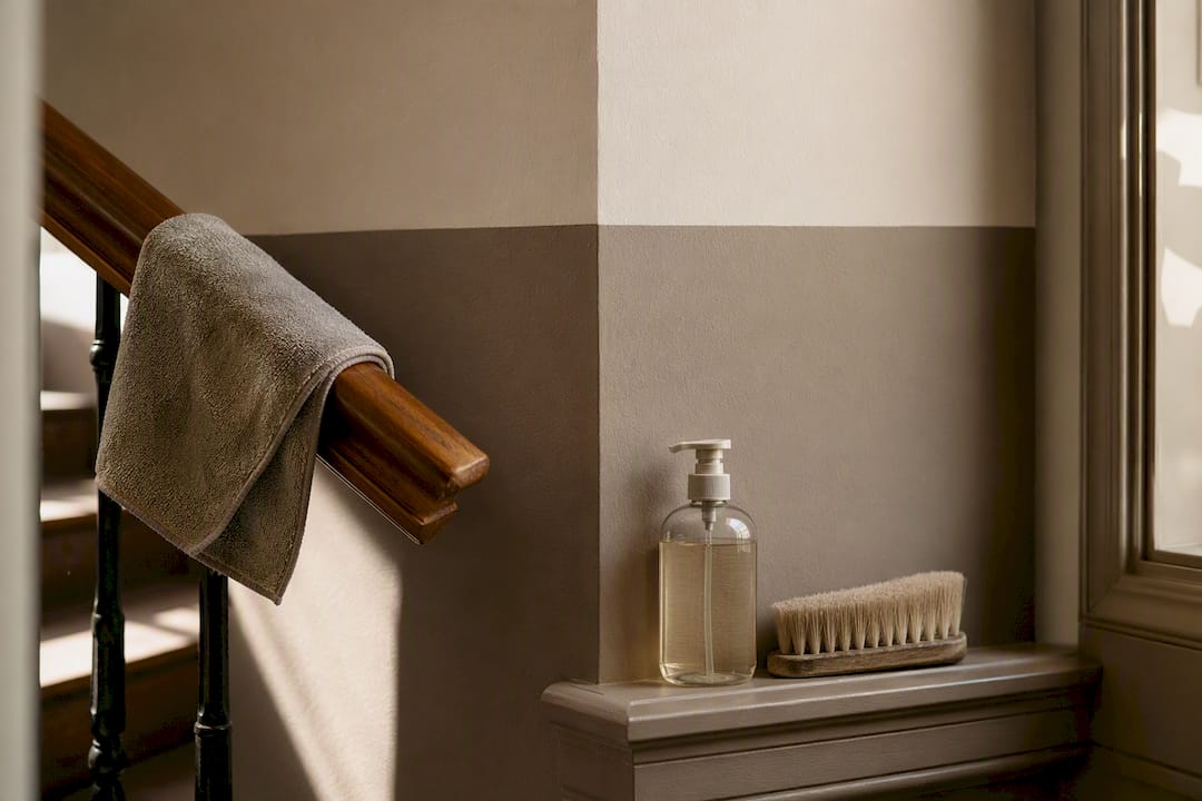
Clean each section according to its finish, not as one uniform wall. A satin or eggshell lower band can usually handle a damp microfiber cloth and mild soap for scuffs and handprints; a matte upper section needs a gentler touch, since scrubbing matte paint too hard can burnish it and leave a shinier patch that stands out under side lighting. Always test any cleaner in a hidden spot first, since two different sheens can react differently to the same product.
Touch-ups on a two-tone wall come with one extra step: keep leftover paint from both colors labeled and stored, because matching a discontinued shade years later is far harder than dabbing a small chip the week it happens. Store cans upside down in a cool, dry spot to keep a skin from forming on top.
Watch the split line itself over time. It’s the one spot where two different paints meet a repeated point of stress, especially near doorframes, light switches, or furniture that gets pushed against the wall. If you notice the line starting to look ragged from repeated cleaning, a thin re-cut with a small brush along the original tape mark refreshes it without repainting the whole wall. And if you ever repaint just one section, the seam is far easier to blend if you kept notes on your original split height and paint sheens, so the new section matches the old one exactly.
Why the “Just Pick Two Colors” Advice Falls Short
Most articles on this topic treat two-tone walls as a color decision. It’s really a proportion decision first and a color decision second. The research bears this out: designers like Sue Wadden are actively steering people away from the mechanical halfway split precisely because proportion, not color choice, is what makes a two-tone wall look designed versus accidental.
The other place conventional advice undersells the project is prep and line quality. Plenty of guides treat taping as a footnote. In practice, the sealing step (a thin coat of the base color painted over the tape edge before the second color goes on) is the single biggest factor separating a clean DIY result from one with visible bleed. Skip it, and you’re gambling on how well your tape happened to stick that day.
If you take one thing from all this: pick your split height on purpose, based on your room’s proportions and how the space gets used, before you even look at paint chips. The color pairing is the fun part, but the height decision is the one that determines whether the finished wall looks intentional.
— Enrico
Get a Flawless Two Tone Finish Without the Guesswork
If the idea of measuring, taping, and cutting in a perfectly level line across an entire room sounds like more patience than you have on a Saturday, check out how to paint walls for professional results at home for practical guidance, or consider letting Sigma Painting fill that gap. Sigma Painting handles two-tone interior projects across the Greater Toronto Area using premium paints, precise measuring methods, and the same tape-sealing techniques covered above, minus the trial and error.

A Sigma Painting two-tone interior job typically includes a complimentary color consultation to nail down your split height and palette, full surface prep and patching, careful taping and line work, two-coat application in your chosen finishes, and complete cleanup when the job wraps. Every project comes with the same transparent pricing and quality standard whether it’s a single accent wall or a full-floor repaint.
If you’d rather hand off the measuring and taping and just enjoy the finished room, request a quote for interior painting and get a clear plan for your two-tone project before any paint goes on the wall.
Sources
- Two-tone walls (Better Homes & Gardens)
- How to Paint Two-Tone Walls (The DIY Playbook)
- How to paint a two-tone wall (ImpactWizards)
- Two-tone wall ideas (Elle Decor)


